03/31 2026
Criteria for assessing the quality of the panorama
These criteria quibble as much as the user sees, because the tours / panoramas checked by these criteria claim to be included in the “Best” category, which means they have to undergo a rather strict quality check.
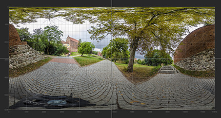
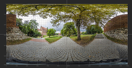
360° panorama's quality Spherical panorama
2K 5
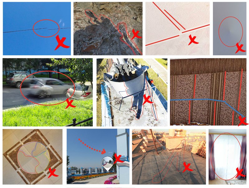
These criteria are applied as much as possible to what the user will eventually see because the tours/panoramas checked by these criteria have to claim to be included in the "Published category", which means they have to undergo a rather strict quality check.
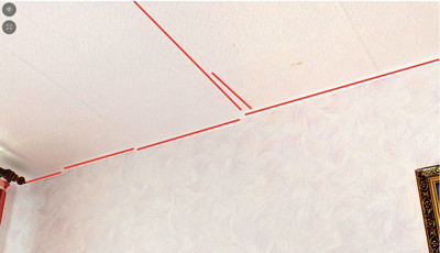
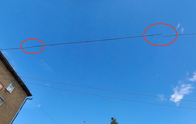
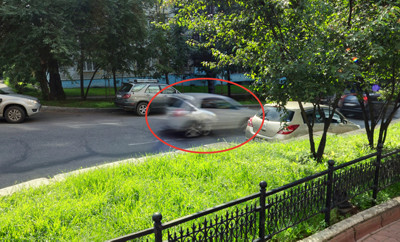
1. The viewed panorama should not have visible stitched original frames, such as color/tone mismatch, element mismatch (a frequent situation of power lines mismatch; car parts on the roadway).
1a. A frequent situation, a ragged corner between the ceiling and the wall. |
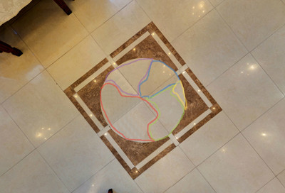
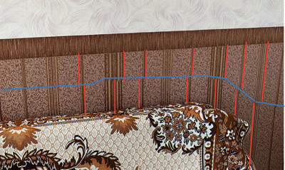 1b. Ripped vertical wallpaper pattern (highlighted in red). The Break line is highlighted in blue. |
1c. "Torn" wires of power lines. |
1d. Translucent parts of cars appear as a result of stitching with the help of the stitching program. |
1.1. Not aligned vertical/horizontal lines.
1.1.a. Not aligned vertical/horizontal lines. |
1.1.b. The horizontal and vertical lines of the photosphere are aligned. |
2. The viewed panorama should not have visible places of stitching frames and mismatch in color and tone. In the case of retouching inconsistencies in color and tone should not be abused tool "Stamp". The presence in the panorama of a large number of cloned sides is not allowed.
2а. Areas of different tonality. |
2b. Explicit Cloned Areas
. |
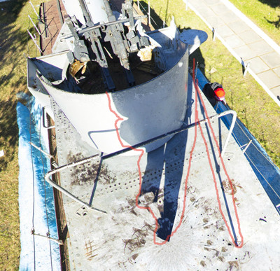
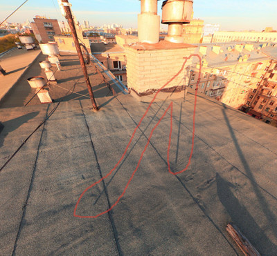
3. The shadow of a tripod/photographer is absolutely not allowed on a spherical panorama!
3a. A unique situation is two shadows! |
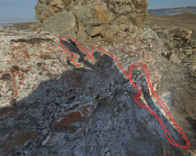
3b. The shadow of the photographer is clearly visible and the shadow of the tripod is partially retouched. |
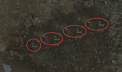
3с. The shadow of the tripod. |
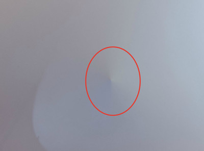
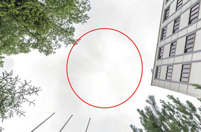
4. The viewed panorama should not have a conical spot that does not match the tone of the surrounding background at the zenith of the panorama.
4а. A conical spot on a spherical panorama. |
4b. A conical spot on a spherical panorama of a street. |
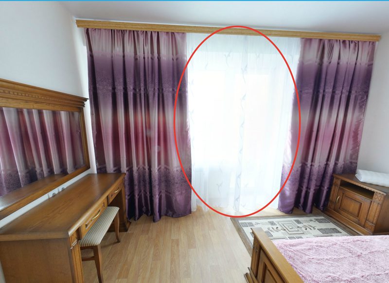
5. If the viewed panorama demonstrates the interior of the room and provided that the panorama has bright light sources (lamps, lamps, etc.), as well as windows/doorways that overlook the street with bright daylight, you should retouch bright areas by other frames obtained of another exposure to exclude "dips" of light.
5. The overexposed area of the window. You must use a frame of another exposure.
6. The displayed space in the panorama must be represented from the best point/angle.
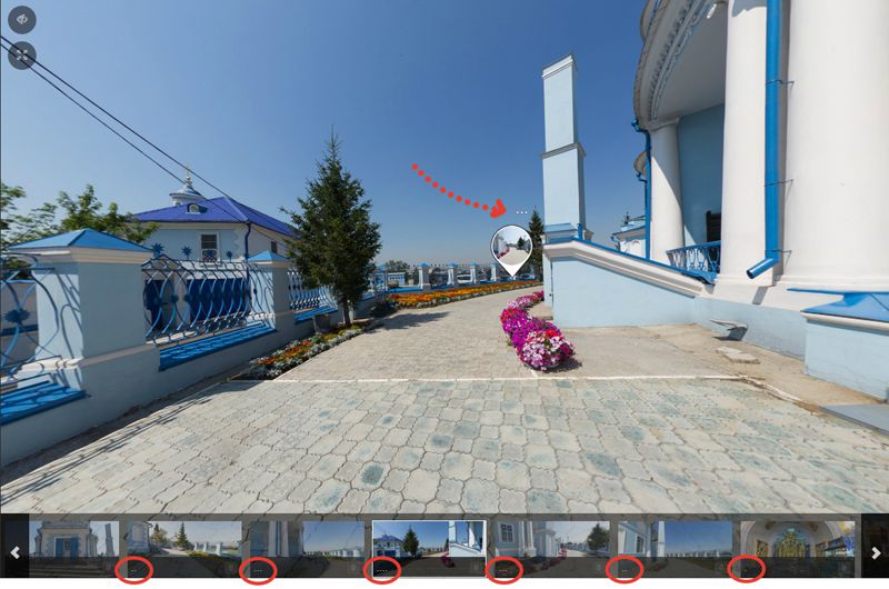
7. Panoramas that are part of virtual tours and located in a direct view of each other need transition points to navigate through the virtual space of the tour. Panoramas that are part of virtual tours and located in an indirect view of each other for these panoramas are also recommended to use the transition points. You should put the transition points for all an interconnected panoramas (if there is a transition from Panorama A to Panorama B, there must be a transition from Panorama B to Panorama A, etc.)
8. A virtual tour should contain mindful captions for the elements of each panorama. The use of signatures "Pass", "Next", "Next / Previous", etc. is not acceptable. It is not recommended to turn off the display of the bottom menu.
8. In this case, it is better to write "Building in the back", "Building in front", "Building on the side", or use the names "Southside", "Northern side", etc.
9. Virtual tour must have accompanying (description) information about the space displayed. It is recommended to use information points to describe places, elements, objects, etc. that are visible in the panorama, which are unique for the displayed space. For example, some monument is visible in the panorama, it will be great to sign it, indicate the name, a link to Wikipedia (if there is information about the object), and place additional photo/video materials about the described object.
-
 today
todayJohn Smith
-
 05/02 2019
Roman Grinev
An English version of this article is available
-
 04/08 2019
Roman Grinev
Herwig thank you for your question. We will translate this article into English soon.
-
 04/08 2019
Herwig
is there an english version of the article?
-
 02/11 2019
Roman Grinev
I agree. We need to work on improving the quality of panoramas. Failure to comply with these quality criteria significantly impairs the perception of the panorama and practically negates the expediency of their use.
Translated from Russian
In order to improve the quality of panoramas on Sferika, there is an idea to add a mechanism for evaluating panoramas for each of these criteria, and then ranking and display them in the "best new" and "popular" section. -
 02/11 2019
Roman Grinev
You also need to think about how the quality of the panorama is affected by the presence of the logo in the nadir. It seems that sometimes the presence of a large logo negatively affects the perception of the panorama space.
Translated from Russian
